The idea of "human" in the design of the top of the model was represented through the flowing and free lines while the concept of "surveillance" at the bottom of the design was shown by the multiple shapes that light took from flashlights.


Option 2: Words - Human(Top,Piccinini) Observing(Bottom,Goodwin)
The top of the design was also based upon the flowing and free nature of humanity while "observing" at the bottom was respresented through the concept of eyeballs from different angles so as to create an atmosphere of always being watched.
Option 2 was chosen for development as Option 1 had too many restrictions on its design. The design of Option 2 was significantly changed to aid the model's spatial development as the draft demonstrated a linear approach to the design. The top design was changed to diminish its linear nature while the bottom was altered due to its spatial problems.
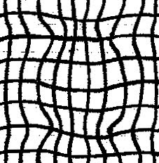
Additionally the use of the "bold" texture at the top was based on my opinion of Piccinini's work whilst the application of the "distorted" texture at the bottom was used to amplify the curvature of the spheres, and the use of textured steel and rusted metal gave an industrial feel to the studio which was inspired by the type of work Goodwin designed.
Textures Used in Model

Bold (Top)
Distorted (Bottom)


No comments:
Post a Comment